


Christmas is a season of many beloved traditions: midnight mass, the Queen’s speech, board games, and Secret Santa. However, over the last decade, another tradition has emerged: big-budget Christmas adverts from British megastores. These are not the run-of-the-mill Christmas ads, flogging the odd product. They are more like high-end short films, often lasting over 3 minutes. The hype and news-coverage they get are now comparable to that Hollywood Blockbusters. Two of the major players in this field are Sainsbury’s and John Lewis. Something of a friendly rivalry has grown between the two, and numerous debates spark online each winter over who won the battle of the Christmas Ads. Being lovers of all things ‘video’ and ‘commercial’, we decided to weigh in ourselves on this, and finally settle who the Lord of the Ads truly is. Sit back, pour yourself a glass of mulled wine, and let battle commence!
2014:
SAINSBURY’S: 1914
This advert depicts the famous Christmas Truce during WW1, where soldiers ceased fighting for a day of peace, sharing an impromptu football. The advert looks incredibly cinematic, with production value that is comparable to Christopher Nolan’s Dunkirk, and the depiction is handled with great sensitivity and attention to detail.
JOHN LEWIS: Monty the Penguin
A truly touching advert showing the friendship between a small boy and his pet penguin, who begins to feel the first pangs of romance. The storytelling is charmingly handled, and the boy is a wonderful young actor. The real star of the ad, though, is Monty. Not only does the CG penguin appear photo-real, but the animators imbue him with a great deal of personality while keeping him naturalistic.
Our Winner:
A very difficult choice, but for its delightful imagination, the winner is JOHN LEWIS!
2015:
SAINSBURY’S: Mog’s Christmas Calamity
Sainsbury’s adapted the character of Mog from a series of beloved children books by Judith Kerr. Mog is a very clumsy cat, who accidentally starts a fire that covers her owner’s house with ash. Luckily, the friendly neighbours save the day by helping to get their house in order. The ad features some very impressive CGI work on Mog, and her design is pretty faithful to Kerr’s simplistic artwork. The slapstick comedy well orchestrated, recalling 2014’s film Paddington.
JOHN LEWIS: Man on the Moon
A sentimental serving of whimsy. A little girl looks through a telescope and sees an old man living by himself on the moon. Despite her best efforts, she can’t seem to get his attention and feels sorry for the lonely lunar pensioner. On Christmas Day, however, she receives a gift from her, carried by balloons. It’s a very well shot commercial. Its mix of fantasy and intimacy recalls the work of Spielberg. Like Spielberg, though, it may be too sugary for some.
Our Winner:
2016:
Sainsbury’s: The Greatest Gift
Sainsbury’s go for a mix of old school (stop motion animation) and modern (a very inclusive cast of characters). This follows a hapless factory worker who realizes that the best gift he can give is spending quality time with his family. While the song is charming and James Corden’s performance enthusiastic, the storyline’s nothing new, and the puppets oddly creepy.
John Lewis: Buster The Boxer
A real work of beauty from John Lewis. Once again, they go for emotional storytelling over broad comedy. A father sets up a trampoline for his daughter one evening. His boxer enviously watches behind a closed door as a group of nocturnal animals bounce on it all night. The next morning, he dashes onto it, ecstatic. The animation, like Monty the Penguin, is superbly done.
Our Winner:
2017:
Sainsbury’s: Every Bit of Christmas
Sainsbury’s eschew big budgets and special effects for something far more stripped down and simple. The ad features real people from all around Britain singing along to a song about the little details that make Christmas, well, Christmas. Its low-fi approach is pretty refreshing compared to other overproduced ads, and gives it a home-made likeability.
John Lewis: Moz The Monster
Once again, a mix of sentimentality with the fantastical. A little boy, afraid of the dark, sees a monster under the bed. They become friends, and the monster helps him overcome his fears. While well-made, the ad faced controversy for allegedly plagiarising from a children’s book called ‘Mr. Underbed’.
Our Winner:
2018:
Sainsbury’s: The Big Night
Sainsbury’s go for a more cinematic approach than the year before. A school Christmas play begins awkwardly as a little girl sings alone on stage, but as the curtains open and other kids rush out, the show transcends to a euphoric crescendo. It’s undeniably cute, and the transition from the near monochrome opening to the vividly coloured finale is smartly done.
John Lewis: Elton John
The ad that got everyone talking this year. Of course, securing living legend Elton John helped create the hype. This is a marvellous piece of filmmaking. As a present-day Elton plays the classic ‘Your Song’, we track back through his life, till we reveal the childhood Christmas present that changed his life. An extremely emotional pay off to a gorgeous piece of work.
Our Winner:
Who do you think is the overall winner? Let us know in the comments area below!


 Even a die-hard cat person wouldn’t resist the happy vibes and charms of Rufus the Corgi! With this mascotte, Amazon conveyed trust and loyalty (the dog) but by using the colour orange, it added an element of happiness (the feeling you get when you receive your Amazon parcel) and dynamism (because obviously, you want that parcel FAST). Perfect.
 The brain
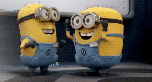


Recent Comments