Monthly Archives

September 2018

Simply Brilliant Ideas in Commercials

By V-Blog

Commercials don’t need to be over the top and effects-driven to grab an audience’s attention. Sometimes, simple is better, and advertising agencies have proven time and time again that it’s better to outsmart the competition than outspend. Here are ten very clever, and very simple, adverts.

1 – Kettle Chips, ‘Simple is Better’

Perhaps the most appropriate way to kick off this list! This ad uses some charming stop-motion animation of kettle chips moving along a white surface, smarty forming images they do so. The ad’s simplicity matches the simplicity of the ingredients.

2 – The Natural Sweet Company, ‘Contemplative Sweets’

A series of ads rather than just one, these quirky commercials are simply still shots of sweets chatting to each other. They are not animated in any way, but the voice-over acting and writing are funny enough to give the fruity stars huge amounts of character.

3 – Burger King ‘OK Google’

Time constraint is one of the great challenges that advertisers face. But Burger King found a smart way to go around the problem in a 15-second commercial. After telling us that 15 seconds isn’t enough time to explain, a Burger King worker says ‘Ok Google, what’s in a Whopper?’ If the viewer has the popular Google Home device, it will answer the question itself. This ad smartly breaks through the fourth wall and uses new technology to its advantage.  Of course, it would have taken far less than 15 seconds to mention the ingredients, but where’s the fun in that?

4 – Innocent Smoothies – I Love…

There’s nothing like including an animal in an advert to boost the cuteness factor, and this rabbit certainly does the trick. Accompanied by his voice-over narration, the rabbit mentions all the fruits he loves and is delighted to find out they are all included in one smoothie.

5 – Apple, ‘Get a Mac’

These are a series of ads that Apple ran, where two actors represent and a Mac and a PC. ‘Mac’ (Justin Long) is a chilled-out dude, while ‘PC’(John Hodgman) is a pretentious and stuffy bore in a bland suit. Mac is effortlessly better in all kinds of ways, much to the vexation of PC. It’s classic character comedy, and they proved so popular the concept was remade in the UK with comedy duo Mitchell and Webb, of ‘Peep Show’ fame.

6 – Kmart, ‘Ship My Pants’

This is a childish use of wordplay to get cheap laughs… and, damn it, it works! Customers are astounded that they can ‘ship their pants’ right there in the store. You can be certain these ads were hits with school-kids, who discovered a new method to get away with naughty words. Kmart’s ‘Big Gas Savings’ ad is equally hilarious. Two very juvenile commercials, but very very entertaining.

7 – Mercedes-Benz, ‘Chicken’

To advertise the stability of their Magic Body Control suspension system, Mercedes eschewed the traditional suave-man-in-a-suit-explains-while-he-drives route most car companies take and instead presented us with this Chicken-based magic.  It’s truly eggsellent (pun, regrettably, intended).

Would you like a brilliant commercial for your own business? Contact us and let’s get rolling!

Finding Story Featured Image

Finding Story

By V-Blog

Why are Pixar movies so darn lovable? The answer doesn’t lie with high-end animation technology or celebrity voice-actors (though they help). The reason why all people across the world have fallen for Pixar is that they tell incredible stories.  Whether they are tales of cooking-obsessed rats or ballooning senior citizens, Pixar’s ability to spin yarns leave audiences howling with laughter and moved to tears. Because of this, they are very hard to forget. Even if you have the memory skills of Dory.


Cognitive Psychologist Jerome Bruner states that stories are 22 times more memorable than facts alone.  In fact, it’s an old trick that if you’re given a list of words to memorize, you’re more likely to remember them if you link them in a story. This is because stories involve us emotionally. We become invested in them, and when we invest emotionally in something we are far more likely to remember it.  

Understanding the importance of good storytelling give advertisers a great advantage. It’s no wonder so many commercials use storytelling as a technique to convince audiences to buy products. Unlike novels and films, however, TV commercials do not have the luxury of time: the average advert is 30 seconds long. Sometimes, even 15 or 10 seconds.  Luckily, advertisers have realized that it’s not the size that matters, it’s what you do with it.

A smart route to take is humour: by adding it, you are not only creating a commercial that will be remembered but that people will tell their friends about and share it online.

Fallon London is an agency that has mastered the art of creating witty and simple advertisements. Take their ad for the Natural Confectionery Company, it simply features sweets having a conversation. There is no animation whatsoever, just close up shots of sweets on table-tops, but the writing and the voicing are so deadpan and funny, they are very rewatchable.

Of course, this quirky approach may suit the brand in this case, however, this may not suit other brands. That’s ok, because part of the advantages of storytelling in commercials is the opportunity to show the brand’s personality, and what it stands for.

Chanel wants to be associated with style and beauty. Therefore, the stories they tell in their commercials are usually lush, filmed in a classical Hollywood style, often starring a famous star.  Dove, on the other, wishes to project the message that beauty comes in all shapes and sizes, and to embrace your natural beauty. Their ads, therefore, feel very naturalistic and sincere and it helps attract everyday women. Brands may even want adverts that tell their own stories, and how they started.

(For more about Brand Story, read this article)

One of the most effective storytelling techniques in commercials is to create recurring characters. Hopefully, the characters will prove to be very likeable, and audiences will become attached to them. One of the most successful examples of this is ‘Compare the Meerkat’ ads series, created for comparethemarket.com, which features a Russian-accented Meerkat.

The character became so popular, it led to a huge boost for the company, with big sales on merchandise and even a series of children’s books being published. When kids are quoting a car insurance ad in the playground, you know the ad agency did something right. As to why the Meerkat has a Russian accent, well, that’s just one of life’s great mysteries…

The development of technology in recent years has led to advertisements becoming increasingly cinematic. At the same time, online distribution has made the need to contain30-second long stories within a 30-second time frame less necessary. It isn’t uncommon now for companies to release short films as commercials. If done well, these generate huge interest and publicity and are widely shared. Sainsbury’s recent ‘1914’ commercial is one example. It is a heartfelt telling of the famous football match that took place between the British and German soldiers one Christmas day during World War 1, a rare moment of peace in the middle of the suffering.

The critically acclaimed advert ended up getting over 19 million views on Youtube. Sainsbury’s decision to tell a historical story with a strong message, rather than promoting their products, displays them a conscientious company.

Storytelling is one of the most effective methods of capturing an audience’s attention and creating memorable adverts. By moving us, warming our heart, or making us laugh, these types of ads make the companies they promote more likeable. That way, the message they are trying to convey is far more powerful.

So if you’re in doubt as to whether stories are the way to go, you can paraphrase our favourite amnesiac fish: “Just keep telling, just keep telling…”

Would you like us to tell your company story? Send us a message and find out how we can help you!

Colour: The Ultimate Storytelling Tool – The Cool Ones

By V-Blog

Colours are considered the ultimate storytelling tool because even before anything happens, they set the mood for whatever it is to come. They propel and convey ideas and emotions and are well known to have a psychological effect upon people, with each colour having its own unique effect. 

THE COLD ONES: Blue, Green and Purple

Where warm colours remind us of heat and sunshine, these cool colours remind us of water and sky, even ice and snow. Cold colours make you feel calm, relaxed and refreshed. Let’s find out how they affect us, and why.

STORYTELLING WITH BLUE:

Blue is the world’s most popular colour, according to surveys. It’s a calming, peaceful colour, thanks to its associations with the sea and sky. Films and commercials have taken advantage of this, often using the blue colour scheme to evoke feelings of serenity. But, of course, blue is also associated with melancholia, sadness and loneliness (which explains the expression ‘feeling blue’). Let’s see some examples of films and commercials to see how directors have used this beloved colour.

1) EVOLUTION OF A CHARACTER IN MOONLIGHT:

Moonlight follows the story of Chiron, a young boy born into poverty in a drug-riddled neighbourhood of Miami, who is bullied for his sexuality. In the scene here above, after teaching Chiron how to swim in the ocean, Juan (a local drug dealer who became his father figure) tells him a story from his youth about an old lady who told him, “In Moonlight, black boys look blue. You Blue. I gonna call you Blue.” This colour will remain significant throughout the rest of the movie. Growing up, this colour will become more and more prominent, signifying how Chiron is slowly becoming more like Juan, even though he is not there with him his influence was still there. It’s also to be noted that blue is also used to depict loneliness and melancholy.

2) THE HEAT IN BLUE IS THE WARMEST COLOUR:

As you might have guessed from the title, the colour blue is used extensively throughout the film—from the lighting in the gay club Adèle visits, to the dress she wears in the last scene and most notably, in Emma’s hair and eyes. For Adèle, blue represents emotional intensity, curiosity, love, and sadness. Adèle also references Pablo Picasso a number of times, who famously went through a melancholy Blue Period. As Emma grows out of her relationship with Adèle and their passion wanes, she removes the blue from her hair and adopts a more natural, conservative hairstyle.

3) THE LONELINESS OF BLEUE DE CHANEL:

In the Bleu de Chanel commercial, Steve McQueen uses the colour blue to emphasize the loneliness of the main character, together with wide empty space to exaggerate the solitude.

4) FREEDOM AND ESCAPE IN BRAZIL:

Director Terry Gilliam uses Blue to in the dream sequences of his nightmarish dystopian film ‘Brazil’. The protagonist dreams of being a winged hero and the bright blue sky he flies through is a relief from the dark grey world he is stuck in during his waking life.

5) INTELLIGENCE AND SOPHISTICATION IN THE ‘SAMSUNG GALAXY’ ADVERT:

Blue is also associated with class and intellectualism. This makes it an ideal colour for technology companies. Facebook, Dell and Samsung have all chosen blue as their company colours. Samsung used a very blue colour scheme for their Galaxy S8 advert.

STORYTELLING WITH GREEN:

Of course, the primary association we have with the colour green is nature, and therefore green has become an excellent choice of colour to when it comes to environmental messages or products that are ecological. It is also a calming colour like blue, associated with simplicity. However, different shades of green can suggest boredom, obsession, sickliness, evil and disgust.

1) OBSESSING ON VERTIGO:

Green is associated with Madeleine and the main character’s obsession with her. The colour becomes more and more prevalent, and eerie, right through the film’s conclusion.

2) THE EVIL IN DISNEY MOVIES:

If you watch a Disney movie and you see the colour green, you are probably in the presence of unfathomable evil. It all began with Snow White with the Evil Queen and her green eyes and the green potion. Green eyes are also sported by the evil stepmother and Lucifer, her horrible cat, in Cinderella. Let’s not forget Scar green glare in the Lion King. Hercules has to swim through the lime green river of souls to save Meg’s life. In the Princess and the Frog, Dr Facilier says “It’s the green that I see” when he conjures his friends on the other side. Ursula the witch takes away Ariel’s voice with terrifying green lightning hands in The Little Mermaid. Last but not at all least, of course, is Maleficent: perhaps more than any other Disney Villain, Maleficent embraces the evil lime-green glow. It even surrounds her castle.

3) ENVIRONMENTAL FRIENDLINESS IN ECODUCA’S CAMPAIGN

Ecoeduca’s global warming campaign shows a disturbing image of a homeless polar bear with her cub. Notice how the green colour is still used here despite the absence of trees or any other vegetation that are naturally green.

4) BOREDOM IN THE MATRIX

Green was used for a number of reasons in the colour scheme of the Matrix. The scenes that take place in the virtual world have a greenish tint, while the scenes in the real world do not. The directors have said that this was inspired by the greenish screens of old computers. It also serves to make the protagonist’s day job seem monotonous and miserable. The greenish hue gives the characters, and workplace, a sickly pallor.

5) SIMPLICITY IN SPOTIFY

This Spotify advert it’s a fun dynamic explanation of how a product works. Green is a great choice of colour. The use of green gives the ad an upbeat feel and a simplicity, that implies that Spotify is an easy-to-use, and fun app.

STORYTELLING WITH PURPLE:

Purple is less commonly used than green, blue and red, maybe because it’s also the rarest colour in nature. It can, however, have a powerful impact on the viewer when used well. It is a lush dreamy colour and is often used in scenes of romance. It also brings to mind fantasy, imagination and magic.

1) ROMANCE IN LA-LA-LAND

Yes, we spoke about La-La-Land (this exact scene actually) in our previous post for the opposite colour of the spectrum, yellow, but we couldn’t help ourselves: this movie is a colour fest. Director Damien Chazelle uses a stunning purple sunset as the backdrop for the first dance between his protagonists Sebastian and Mia, where they begin to fall in love. It’s a dreamlike scene, and the purple background gives it the dance the romantic fanciful feel it needs. Emma Stone’s yellow dress matches it perfectly. The purple was so effective it became the central colour of the films advertising campaign and poster art.

2) QUIRKY FANTASY IN THE CADBURY’S GORILLA ADVERT

Purple can add a lot of quirkiness to an advert. This can be seen in the Gorilla Cadbury ad, where a musical savvy primate drums away to a Phil Collins’ song. It also ties in the brand’s main colour.

3) EROTICISM IN ‘BLADE RUNNER 2049’

Purple is a sensual colour, a cross between the passion of red and the serenity of blue. This makes it a colour that is often associated with eroticism and sexuality. Director Denis Villeneuve does this brilliantly in a stand-out scene from his sequel ‘Blade Runner 2049’. The protagonist is walking by himself, the blue colour of the scene matching his loneliness, before a purple light washes over his face. We then see a giant purple hologram of a nude lady, an advert for a virtual girlfriend called Joi, promising the buyer happiness. It’s a hugely memorable moment and a stunning use of colour.

4) THE DUALITY OF THE PURPLE LIGHTSABER

As Luke Skywalker taught us in the original trilogy, a good guy can feel anger and hate sometimes without fully giving over to the Dark Side. What better way to represent this duality than with a cool purple weapon? How the colour purple is created by mixing red and blue says a lot about the Jedi wielding it.

5) LUXURY AND FANTASY IN THE VIRGIN AMERICA CAMPAIGN

Virgin America is a brand that uses colour in an unusual way. Their logo colours are red and white, but their brand colours are purple and pink; in this campaign, everything from the plane cabin lights to their billboards to their website reflects this colour scheme. In this print ad, they use the colour purple to drive home a feeling of luxury, exclusivity, and imaginativeness while maintaining their trademark humorous visual tone.


Drop us a line and find out what colour will suit your marketing campaign and how we can help you!

The Stats of Videos for Marketing in 2018

By V-Blog

Online videos drive better engagement and they are seeing huge response rates. Studies show that by 2019, they will make up for 80% of all internet traffic. We have put together this new infographic of key video stats for 2018, and the number speak for themselves. 

Still unsure if you should implement videos in your marketing strategy? This data might just convince you!

Maybe you already thought about producing videos for your business, but you don’t know where to start. Don’t fret, we are here to help! Just send us a message, or give us a ring! Let’s start discussing what it’s the best type of video for your marketing campaign. The possibilities are endless!


Colour: The Ultimate Storytelling Tool – The Warm Ones

By V-Blog

Colours are considered the ultimate storytelling tool because even before anything happens, they set the mood for whatever it is to come. They propel and convey ideas and emotions and are well known to have a psychological effect upon people, with each colour having its own unique effect. 

THE WARM ONES: Red, Orange And Yellow

These toasty colours are categorized as warm because as the name says, they remind us of warm things like sunlight or fire. Warm colours are associated with heightened emotions and passion. They are also associated with joy and playfulness, as well as being considered stimulating. Let’s have a closer look at how they affect us, and why.

STORYTELLING WITH RED:

Let’s start with the most attention-grabbing colour of them all: red. The reasons for this colour being so impactful may be evolutionary: red is the colour of blood, it evokes violence and danger. For the very same evolutionary reason, amazingly red also evokes life in its primal form: lust, passion and love are almost always represented in this hue. This colour is a true drama queen: it has the power to make anything stand out, and that’s why is one of the most used colours in commercials, where attracting the audience’s attention quickly is crucial.

1) SETTING A MOOD: ‘THE SHINING’:


A reminder of violence and danger, red is one of the most used colours in horror films. The bright red bathroom in ‘The Shining’ is a masterful example of that, as well as the ominous words Red Rum (murder in reverse) we see throughout the movie. Genius.

2) HIGHLIGHTING AN IMPORTANT FEATURE: IKEA’S RED LAMP


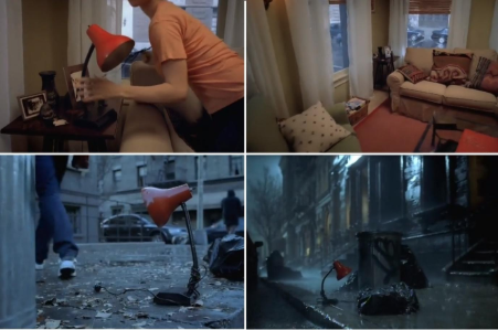
In the 2002  ‘Lamp’ advert of Ikea (directed by Spike Jonze), the red is used to both attract our attention and stir our warm feelings towards it when it’s juxtaposed against a cold environment.

3) REVEALING CHARACTERS: BABY DRIVER


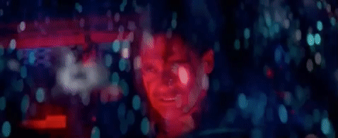
Bats is very clearly the most violent character of all and, for that reason, he is dressed in red throughout the entirety of the film. A more interesting character is Buddy: he starts as being a cool guy, dressed in cool hues. But as the story evolves and anger takes over him, he becomes enveloped in red lights and red hues.

4) A STATE OF MIND: ‘AMERICAN BEAUTY’


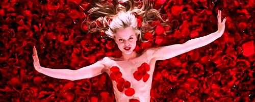
Sam Mendes made full use of this colour in American Beauty: warmth, danger, love, sex, death, rage, lust, and beauty. Red is the colour used for the women’s clothing, the cars, the doors and also (spoiler alert!) it is the colour of Lester’s blood splattered across the white table.

5) GETTING NOTICED, IN A LEGENDARY WAY: COCA-COLA


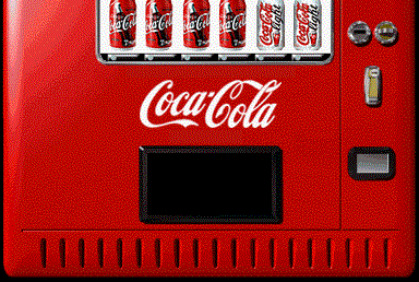
The Coca-Cola red is iconic. We could write a book about Coca-Cola marketing successes, but let us just tell you this: we can thank Coca-Cola for Santa as we know it. Originally dressed in green or brown, once Coca-Cola featured him dressed in red in their advertising, the red Santa stuck. Forever.

STORYTELLING WITH ORANGE:

This colour radiates warmth and happiness. It’s associated with amusement, the unconventional, extroverts, warmth, fire, energy, activity, danger, taste and aromaIt’s not a coincidence that orange is the colour representing Buddhism, where it symbolizes illumination, the highest state of perfection. Studies show that the orange colour can cause actual physical effects such as increased hunger, heightened sense of activity, increased socialization, and stimulated mental activity. How cool is that? Guess what it can do for your marketing campaign! Let’s see it in action:

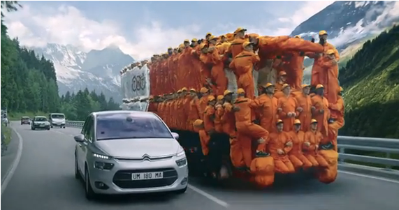
1) CHEAP AND CHEERFUL: EASYJET


It’s not a surprise that a low-cost airline chooses a bright, lively orange as their theme colour. It plays into the positive feeling of abundance: you can afford to fly away more often. It also communicates friendliness, helpfulness and being easy going.

2) BRING ON THE ENERGY: TNT


It’s all about energy and happiness for TNT: they have understood how to be unconventional in the best possible way.

3) HEAT AND DANGER: MAD MAX


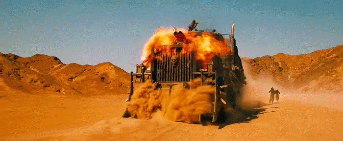
It’s a trend for movies today to sport a palette of orange and teals (stay tuned for a feature on this topic), but here in Mad Max, the orange has been blown at its full potential, conveying the heat of the desert, the heightened activity occurring on screen as well as danger.

4) HAPPINESS: MEET RUFUS THE CORGI, MASCOTTE OF AMAZON

Even a die-hard cat person wouldn’t resist the happy vibes and charms of Rufus the Corgi! With this mascotte, Amazon conveyed trust and loyalty (the dog) but by using the colour orange, it added an element of happiness (the feeling you get when you receive your Amazon parcel) and dynamism (because obviously, you want that parcel FAST). Perfect.

5) WARM & FUZZY: COCO


Coco is set in the Land of the Dead, however, instead of being creepy, it looks even livelier than our world. Surprised? Not really: warmth and happiness are brought forward by the clever use of the Mexican marigold orange flower.

STORYTELLING WITH YELLOW:

The most noticeable colour by the human eyes, it’s also the brightest. Like the orange, it conveys happiness, but also energy and dynamism. However, it’s also the most bipolar colour: on one side, it’s very warm, playful, optimistic and happy. On the other side, it can also induce a state of anxiety, agitation and alert. It’s definitely a very powerful colour that needs to be treated with expertise.

1) POSITIVELY OPTIMISTIC: LA LA LAND


La-la-land was released in miserable January, and the costume designer Mary Zophres has intentionally utilised the positive power of this hue to make viewers feel great about the lead character Mia Dolan on screen, offering a joyful antidote to the post-Christmas blues.

2) HUNGRY? MCDONALD

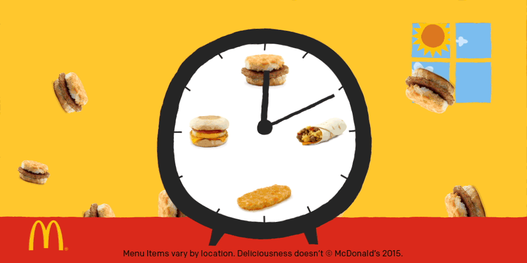
The brain processes colour before it processes words or shapes, so the fast-food chain chose these two colours for their logo and brand. Red and yellow makes you hungry, encouraging you to want to buy the product they sell, while also making you feel happy.

3) FUNNY AND LIVELY: MINIONS


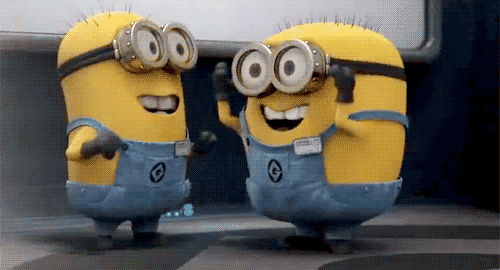
Yellow is the happiest colour, which suits the banter-loving, fast-moving Minions. It’s not a coincidence that when the minions turn evil after ingesting the potion in the movie they turn purple, which is on the opposite of yellow on the colour spectrum.

4) NOTICEABLE: POST IT NOTES


Colour in marketing is not always a science: as a matter of fact, sometimes it’s just bare luck, as it was for Post It notes. Its now iconic Canary Yellow colour was chosen by coincidence — a lab next door only had scrap yellow paper on hand, and they used it. And it worked! It is, after all, the most visible colour in the daylight, very useful for notes and reminders!

5) OBSESSIVE DICK TRACY


Yellow is the colour of caution, it brings power, energy and anxiety. Dick Tracy wears a bright yellow coat and hat, the screen becomes energised whenever Tracy enters. Because the yellow usage here is brash and daring, it represents obsession (according to scientists in fact, yellow is the colour a person sees first and forgets the least). Tracy is the obsessive detective caught up in his case.


Amazing, right? If you want to know which colour to use to improve your marketing campaign, send us a message, we look forward to hearing from you!

Stay tuned for the next post: The Cool Ones!